How to Choose Living Room Colors: Rules and Combinations

Start from the colors you like, check them on a color wheel, split them 60-30-10, add texture and pattern, then pick a combination that fits how you use the room.
On a weekday evening your living room is the place where the family reads, watches TV and talks. On the weekend it is where you receive guests. One color scheme has to work for both.
That makes the living room harder to paint than a bedroom. It is the center of most homes, where people spend more time than anywhere except their own rooms. A bedroom is private. A living room is also for guests, so its colors must suit every use.
There are so many palettes that it is hard to settle on one. Here is how to choose living room colors that you will still like in a few years: the basic rules, textures and patterns, and color combinations that work.
What color should a living room be?
A color you like and can live with for years. Trends change faster than most people repaint, so start from your own taste and check it against the rules below.
Choosing a palette is both simple and difficult. Simple, because there are many guides to follow. Difficult, because there are many guides, and a lot of them contradict each other. So take the logic behind each rule below, then adapt it to your home, your family, where you live and who you are.
Trends are temporary
Color trends come and go, but you will most likely not repaint the living room every time they change. The obvious reason is cost: repainting is expensive.
So do not start from the palette that is popular today. Start from the colors you like. They become the base of your paint plan, and you can adjust the details as the months and years pass.
- Why it works: a color you chose for yourself does not go out of date when the trend does.
- The trade-off: your own taste is not a system. The next two rules give it one.
Use a color wheel
Color theory sounds like something for artists and designers, but anyone can use it. You need one tool: a color wheel. You can view one online, buy a physical one, or get one free from a paint store.
Turn the wheel and you see which colors work together and which do not. A wheel is simple and will likely not show every shade you are considering. Still, it is an inexpensive way to get ideas and avoid big mistakes.
What is the 60-30-10 rule in interior design?
It is a classic ratio for a color scheme: one main color covers 60 percent of the room, a second color 30 percent, and an accent color 10 percent.
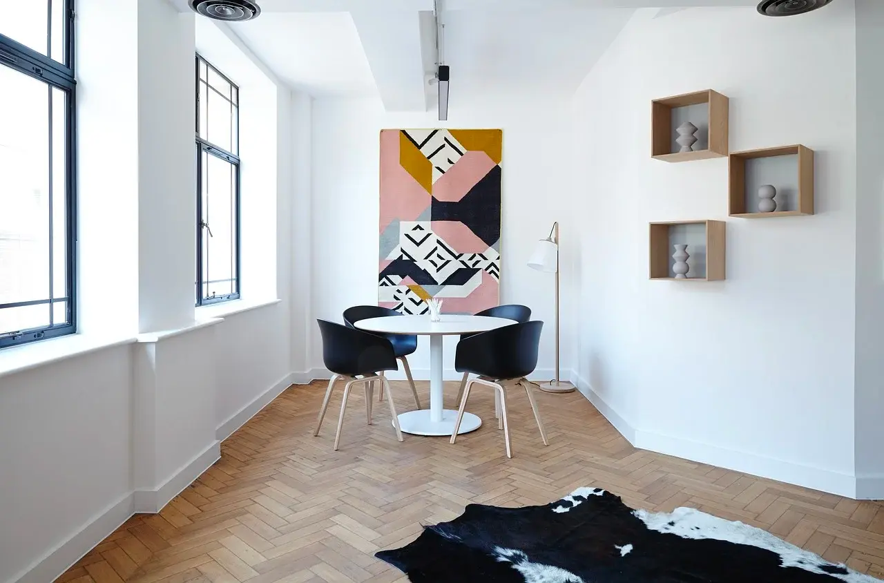
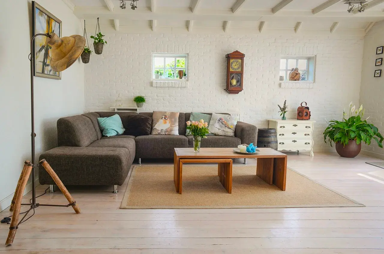
White covers most of the room, the black chairs carry the second color, and one painting brings the accent.
- 60 percent, the main color: the walls, large decor such as a carpet, and large furniture such as the sofa.
- 30 percent, the secondary color: smaller objects, such as single chairs, the drapery and perhaps an accent wall.
- 10 percent, the accents: the smallest objects, which add a distinct color that contrasts with the rest of the room. Accessories, artwork and linen are practical accent pieces.
This is not a hard rule. Many designers use 60-30-10-10 to add a second accent. Adapt the ratio to what you like.
Common mistake: adding accents until they take over. When accents spread to large surfaces, nothing stands out any more.
Texture and pattern: more shades without more colors
Light and shadow can add shades to a room without a new color. When light falls across a three-dimensional object of a single color, its surface shows a series of shades. That depth gives a quiet richness to the colors of the room.
Fabrics give this effect most easily: drapery, upholstery, even tapestries. Wool, silk, velvet and satin all work well. Natural materials such as wood and certain metals add texture too. So can concrete and textured wall finishes. Antique furniture that shows the marks of time also helps.
Texture shows best where there are both dark and light areas. So add lighting for this purpose. One simple way is to place a light at an angle to the textured surface.
Patterns work at a small scale and at a large scale.
- Small scale: most homes add pattern through rugs, cushions and similar decor. Artwork on display is a pattern too. Many flat-screen TVs can show images while they are idle. Use one to put a pattern on a wall you cannot use for anything else.
- Large scale: arrange several objects on purpose, such as frames of artwork, chairs from one set, or runners and rugs. Frames are the most common choice. You will often see similar picture frames placed in a diagonal line or in a deliberate shape.
Which living room color combinations work?
Bright, warm colors next to dark, restrained tones, or soft pastels next to neutrals. A small accent in an unexpected color adds the last touch.
Bright and warm. In 2022, after 2 difficult years, bright colors that signal optimism were the trend. Shades of yellow, orange and blue bring summer to mind. They make a room feel warm and support cheerful conversation.
- Pair it with: black, chocolate or charcoal. The restrained tone gives the bright colors a contemporary look.
Soft pastels. If bright colors are not for you, choose gentle blue, green or pink. They are calm and they work in many rooms.
- Pair it with: neutral colors. Pastels look their best next to them.
A playful accent. Add a small amount of an unexpected color, such as bright pink or red. Keep it inside the 10 percent.
How do you test living room color ideas before you paint?
Try them on a plan of your own room first. In Home Planner you can change the wall color and see the room in 3D before you buy paint.
Combining colors is hard if you have no background in art or design, and a paint sample on a card tells you little about a whole room. The Home Planner App removes the guesswork: it shows you the result on the walls of your own room. It is free to download.
Measure your space and draw it as a 2D/3D floor plan. Then furnish it with products from well-known brands, make visualizations of the finished room, or start from ready-made layouts for a bedroom, a bathroom or a living room.
Try it on your own project
Free room planner and interior design app